Applies to: SharePoint Online and On-Premises
Product:
SharePoint Online – 2.0
SharePoint On-premises – 3.7
Description
NITRO Forms has lot of built in functionality to create dynamic forms and customize the form UI as required in common business applications. For any custom requirements, you can add CSS and JavaScript on the form to change the UI and functionality. This article lists some CSS examples to change the look and feel of the NITRO Forms.
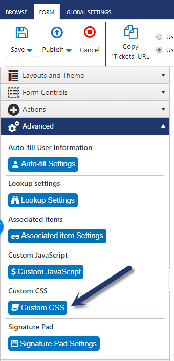
Please note that to apply this CSS on the Form, you need to open NITRO Forms designer from List Settings. After that open “Custom CSS” section under “Advanced” section on the left bar. After specifying the CSS, publish the forms. You can clear browser cache or try in private browsing session in case new changes are not immediately working.
- Use Case 1: Custom CSS to show Choice / Radio column options in single line instead of one below the other
- Use Case 2: Add image for tabs in NITRO Forms using Custom CSS
- Use Case 3: Modify the background color in the NITRO forms
- Use Case 4: Modify width, color and hover over color for Submit Action in NITRO forms
- Use Case 5: Modify width, color and hover colors for Script Actions in NITRO forms
- Use Case 6: Modify color and hover colors for Custom Actions in NITRO forms (Display Form)
- Use Case 7: How to change the form/column row/column control color based on a choice column value change on the form?
- Use Case 8: Set default behavior of ‘New Item’ button only as inline mode in NITRO associated items column
- Use Case 9: Custom CSS for repositioning ‘Action’ buttons in the NITRO Forms
Use Case 1: Custom CSS to show Choice / Radio column options in single line instead of one below the other
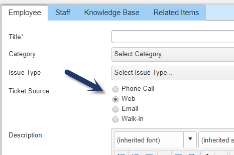
By default, multi-choice options and radio button options are listed one below the other in separate lines. If you want to have them listed one after the other in same line then use the below CSS. Please note that you need to replace “InternalName” in below CSS with the actual internal name of the choice column for which this change is required:
#row_InternalName #ccs_control_InternalName > div {

display: inline-block !important;

margin-right: 5px !important;

}
#row_InternalName #ccs_control_InternalName > div > label {

vertical-align: text-bottom;

}
Checkbox/Radio Button appearance in the form without any custom CSS:
Checkbox/Radio Button appearance in the form with custom CSS:
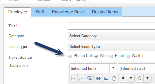
Sample CSS used for “Ticket Source” column:
#row_TicketSource #ccs_control_TicketSource > div {

display: inline-block !important;

margin-right: 5px !important;

}
#row_TicketSource #ccs_control_TicketSource > div > label {

vertical-align: text-bottom;

}
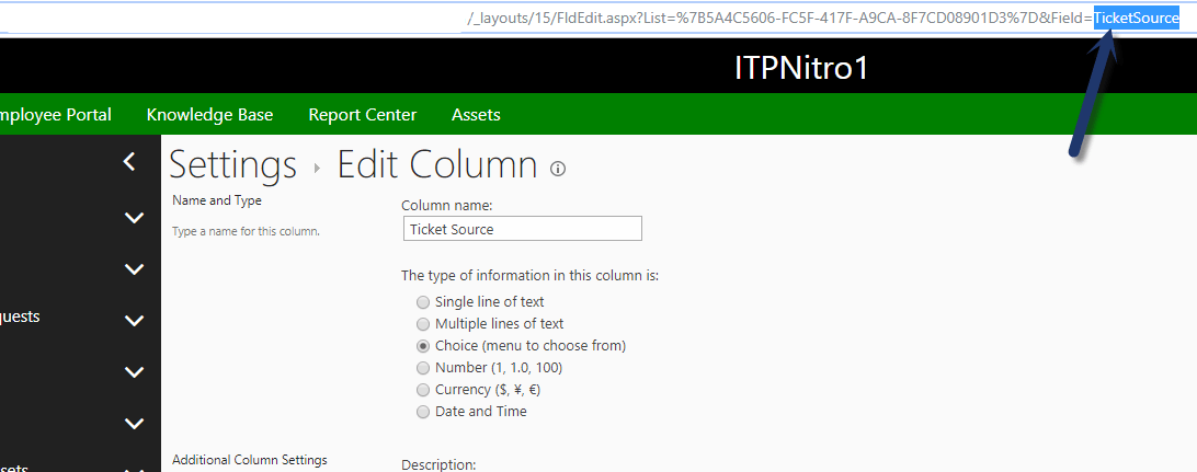
Note: To get internal name of the column, please go to site contents –> navigate to the required list –> List settings –> edit the choice column and search for the internal name of the column in the URL at the end. See sample screenshot below
Use Case 2: Add image for tabs in NITRO Forms using Custom CSS
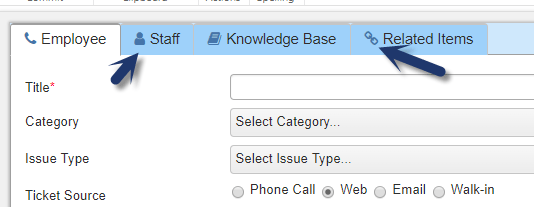
Add icons for the tabs in the NITRO forms. See sample image below:
We can get the available icons from this link: https://fontawesome.com/v4.7.0/icons/
Navigate to the above link and search for the icon to be set in the tab, click on the search result.
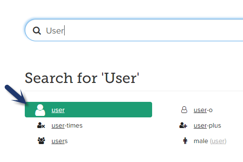
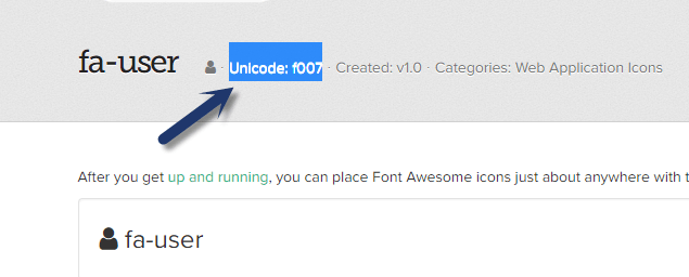
Copy the Unicode of the icon to use in the custom CSS.
CSS to insert icons for tabs:
Syntax:
Note: The “Index” value in below script has to be replaced with the index of the tab starting from 1 from left to right
ul#panelCCSTabs > li:nth-child(Index) > .k-link:before { /*Index = 1 for first tab, 2 for second tab, .. */

font-family: FontAwesome;

content: "\f095"; /*Unicode of icon to be set here*/

padding-right: 5px;

color: #4575aa;

}
Sample code for the NITRO Form
ul#panelCCSTabs > li:nth-child(1) > .k-link:before {

font-family: FontAwesome;

content: "\f095";

padding-right: 5px;

color: #4575aa;

}
ul#panelCCSTabs > li:nth-child(2) > .k-link:before {

font-family: FontAwesome;

content: "\f007";

padding-right: 5px;

color: #4575aa;

}
ul#panelCCSTabs > li:nth-child(3) > .k-link:before {

font-family: FontAwesome;

content: "\f02d";

padding-right: 5px;

color: #4575aa;

}
ul#panelCCSTabs > li:nth-child(4) > .k-link:before {

font-family: FontAwesome;

content: "\f0c1";

padding-right: 5px;

color: #4575aa;

}
Use Case 3: Modify the background color in the NITRO forms
We can modify the background color for the NITRO Form by using custom CSS option. Please visit http://www.colorzilla.com/gradient-editor/ to generate the required background color CSS code. After that copy the CSS code from this page to be used in our NITRO Forms:
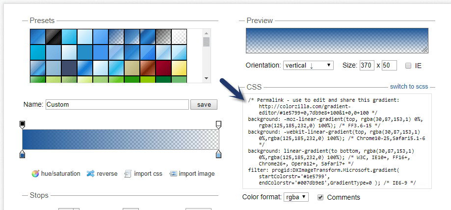
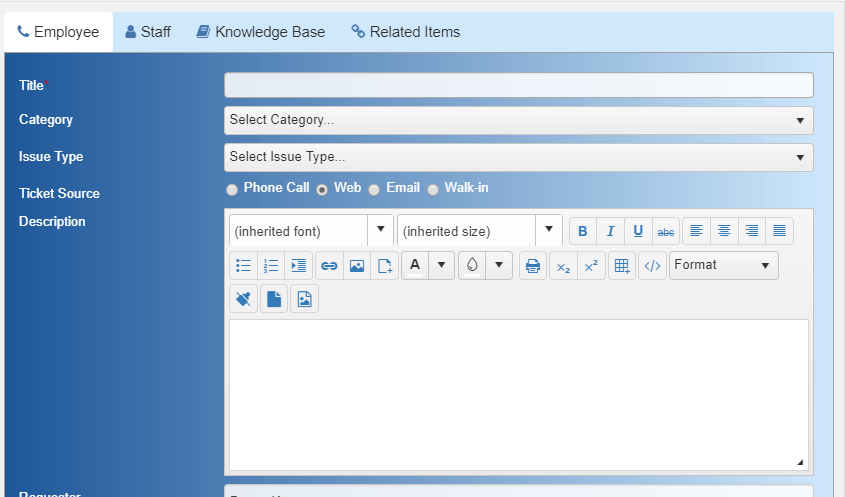
Insert the copied CSS in the NITRO Form and publish the NITRO Forms to see the new background color for the forms. Please note that different CSS is required depending on whether you are using Tabs or Sections layout in the form.
Sample CSS code (for form layout with tabs):
p.k-content#panleFormControls {

/* Permalink - use to edit and share this gradient: http://colorzilla.com/gradient-editor/#1e5799+0,7db9e8+100&1+0,0+100 */

background: -moz-linear-gradient(left, rgba(30,87,153,1) 0%, rgba(125,185,232,0) 100%); /* FF3.6-15 */

background: -webkit-linear-gradient(left, rgba(30,87,153,1) 0%,rgba(125,185,232,0) 100%); /* Chrome10-25,Safari5.1-6 */

background: linear-gradient(to right, rgba(30,87,153,1) 0%,rgba(125,185,232,0) 100%); /* W3C, IE10+, FF16+, Chrome26+, Opera12+, Safari7+ */

filter: progid:DXImageTransform.Microsoft.gradient( startColorstr='#1e5799', endColorstr='#007db9e8',GradientType=1 ); /* IE6-9 */

color:white;

}
Sample CSS code (for form layout with sections):
div[id^="panelSection"] {

background: -moz-linear-gradient(left, rgba(30,87,153,1) 0%, rgba(125,185,232,0) 100%);

background: -webkit-linear-gradient(left, rgba(30,87,153,1) 0%,rgba(125,185,232,0) 100%);

background: linear-gradient(to right, rgba(30,87,153,1) 0%,rgba(125,185,232,0) 100%);

filter: progid:DXImageTransform.Microsoft.gradient( startColorstr='#1e5799', endColorstr='#007db9e8',GradientType=1 );

color: white;

}
Sample Image:
Use Case 4: Modify width, color and hover over color for Submit Action in NITRO forms
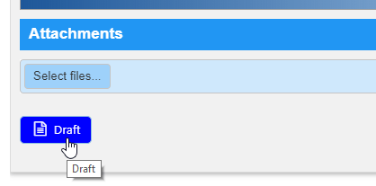
To set the submit action color and hover color we can use custom CSS in our form settings. See sample code from below:
/*Submit Action Button Width and Color*/
button.ccs_btn_SubmitAction {

width: 150 px !important; background: green;

}
/*Submit Action Button Color on hover*/
button.ccs_btn_SubmitAction:hover {

background: #0000ff;

}
Note: For hex color codes, you can visit this page.
Sample Submit action button with custom color:
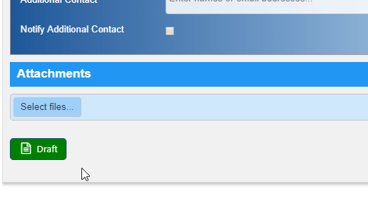
Hover Color:
Use Case 5: Modify width, color and hover colors for Script Actions in NITRO forms
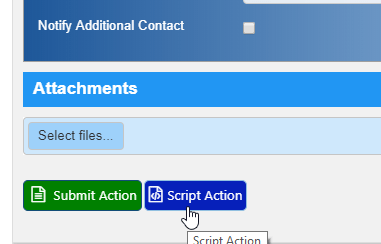
To set the script action color and hover color we can use custom CSS in our form settings. See sample code from below:
/*Script Action Button Width and Color*/
button.ccs_btn_ScriptAction {

width: 150 px !important; background: #161c3c;

}
/*Script Action Button Color on hover*/
button.ccs_btn_ScriptAction:hover {

background: #0620ba;

}
Note: For hex color codes, you can visit this page.
Sample Script action button with custom colors:
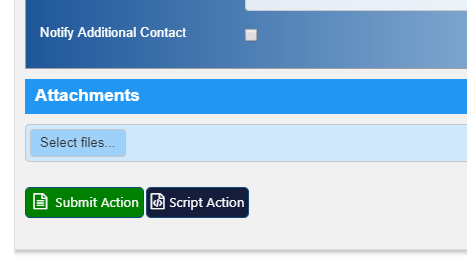
Hover Color:
Use Case 6: Modify color and hover colors for Custom Actions in NITRO forms (Display Form)
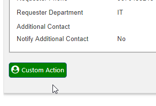
To set the custom action color and hover color we can use custom CSS in our form settings. See sample code from below:
/*Custom Action Button Color*/
button.ccs_btn_CustomAction {

background: green;

}
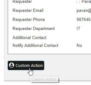
/*Custom Action Button Color on hover*/
button.ccs_btn_CustomAction:hover {

background: #1a1c1a;

}
Note: For hex color codes, you can visit this page.
Sample Custom action with custom color:
Color:
Hover Color:
Use Case 7: How to change the form/column row/column control color based on a choice column value change on the form?
Please refer instructions from this Article
Use Case 8: Set default behavior of ‘New Item’ button only as inline mode in NITRO associated items column
In NITRO Forms, associated items can be added in two ways:
- Inline
- Popup
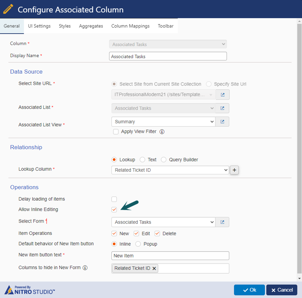
To edit items inline in associated item column, we need to enable “Allow Inline Editing” option in NITRO Associated Items column settings as shown below:
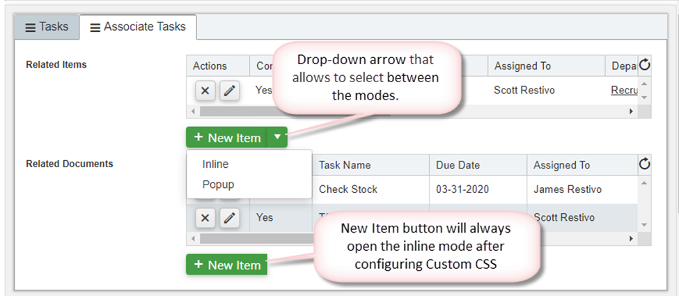
By enabling Inline editing, users will see both “Inline” and “Popup” options in the “New Item” button dropdown in associated item column as shown below. Based on the requirement, we can select any of the option to create new items.
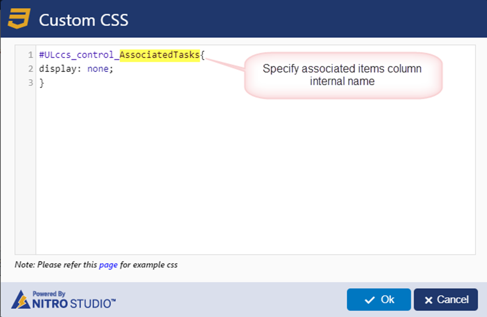
Currently there is no settings option to hide the “Popup” mode from “New Item” button dropdown. If required, this can be achieved through custom CSS in NITRO forms. In this sample use case, we have configured custom CSS in NITRO forms to achieve the same.
Steps
- Configure below CSS in ‘Custom CSS’ section in the NITRO forms designer settings.
Go to the list -> List Settings -> Crow Canyon NITRO Forms -> ‘Advanced’ section in the left-hand panel -> Custom CSS -> Add below script.
Custom CSS:
#ULccs_control_ColumnInternalName{
display: none;
}
Note: Replace “ColumnInternalName” in the script with internal name of associated items column.
To find internal name of the column, please refer this article.
Use Case 9: Custom CSS for repositioning ‘Action’ buttons in the NITRO Forms
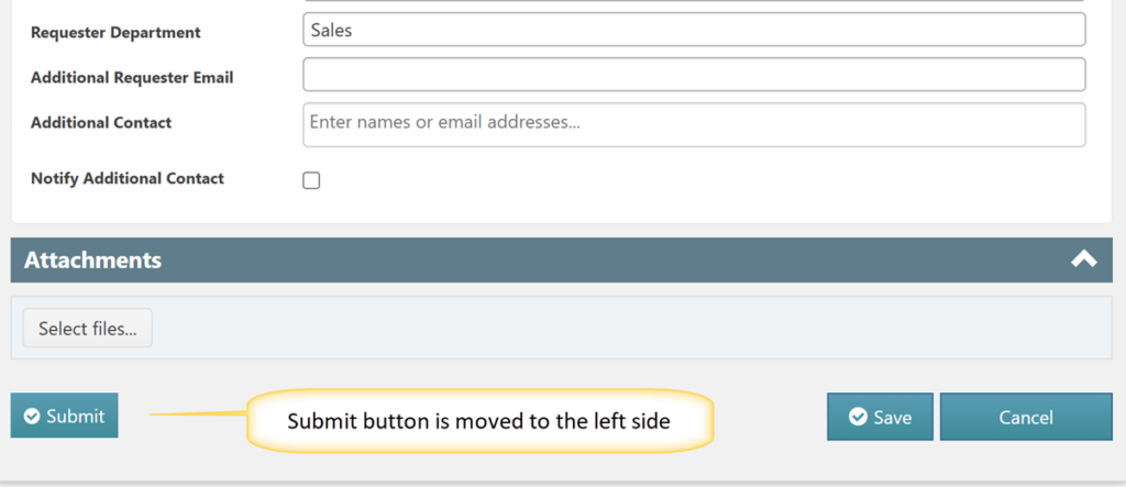
In NITRO Forms, action buttons are aligned together by default. Users may need to customize the placement of these buttons for better form layout and usability. A common requirement is to position one button to the left while keeping the remaining buttons to the right. This can be achieved using custom CSS based on button’s action ID.
Steps:
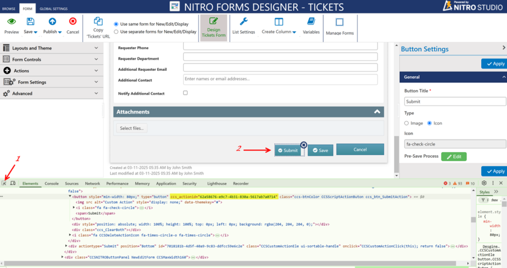
- Identify action ID of the button that needs to be moved to the left.
Navigate to NITRO forms designer for the list -> Click F12 to open developer tools -> Click arrow icon from the developer tools pane -> Select the ‘Submit Action’ button -> Locate and copy its action ID as shown below:
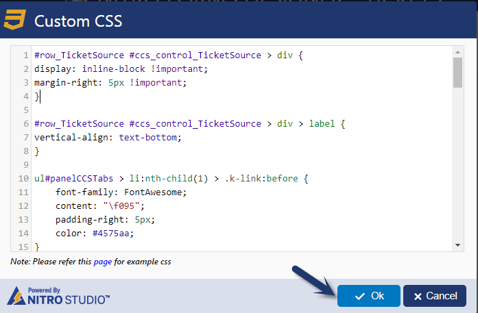
2. Configure Custom CSS. Expand ‘Advanced’ section from the left-hand panel -> Click ‘Custom CSS’ -> Specify the below CSS with ‘Submit Action’ button Id:
div#row_<Button_ACTION_ID> {
    float: left !important;
}
Note:
- Replace ‘<Button_ACTION_ID>’ with ‘Submit Action’ button Id copied in #1 above.
- Same steps can be followed to reposition ‘Script Action’, ‘Submit Action’ and ‘Custom Action’ buttons.
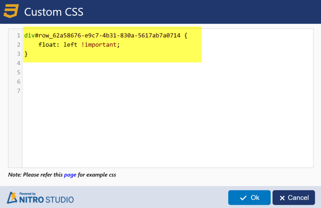
3. Click Ok -> Publish the NITRO Forms. Refresh the form to see the button repositioned.
Sample Output:
