Applies To:
SharePoint Online and SharePoint On-premises
Description:
Crow Canyon List View is a NITRO component that provides enhanced capabilities to view the SharePoint list items. One such capability includes an option of viewing the List View in ‘Mobile Mode’ for devices with screens of different sizes and resolutions.
This article covers detailed description of ‘Mobile Mode’ feature in Crow Canyon List View.
Configuration for Crow Canyon List View in Mobile Mode:
To display the NITRO List View in a mobile friendly layout, configure the mobile mode settings in a list view component through the below path:
Navigate to Site Settings –> Crow Canyon List View –> Edit an existing List View definition or configure a new List View –> Select ‘Mobile Mode’ tab as shown below:
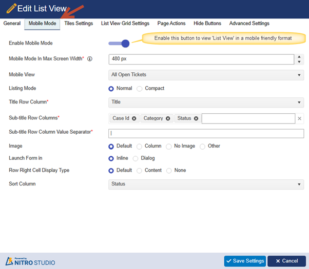
Various options present under this tab are as follows:
Enable Mobile Mode:
We can enable or disable the mobile mode using the toggle button as shown in the above screenshot.
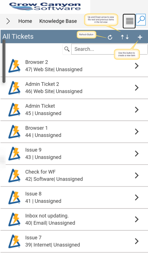
On enabling this option, the configured list view becomes compatible for viewing on the mobile devices. A sample screenshot for this view is as shown below:
Mobile Mode In Max Screen Width:
In this option, we can specify the width of the screen in pixels for a device where the List View is rendered. For devices with a screen width of 1024 pixels or more, the List View seamlessly adopts the ‘Desktop’ mode. Whereas, for devices with a screen width below 1024 pixels, the List View is displayed using ‘Tablet’ and ‘Mobile’ modes.
This pixel size can be specified depending upon the screen width of the device used for viewing the list.
In this example, we have specified the screen width as 480 pixels.
Mobile View:
All the list views configured in ‘General’ tab are shown in this ‘Mobile View’ dropdown and the selected list view items is displayed in the mobile experience.
Listing Mode:
We can show the items in List View in ‘Normal’ or ‘Compact’ mode.
- Normal:
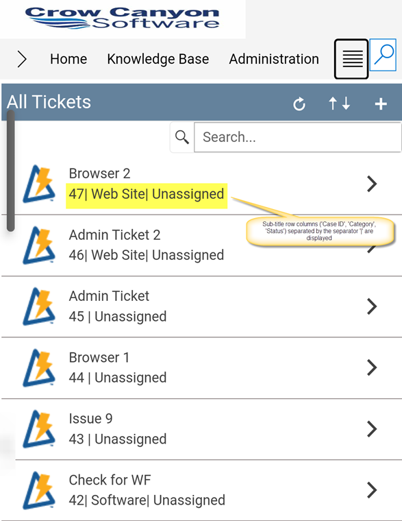
When normal mode is selected, then the sub-fields ‘Sub-title Row Columns’ and ‘Sub-title Row Column Value Separator’ are also available as shown below:

Sample output of List View using ‘Normal’ mode is as shown below:
- Compact:
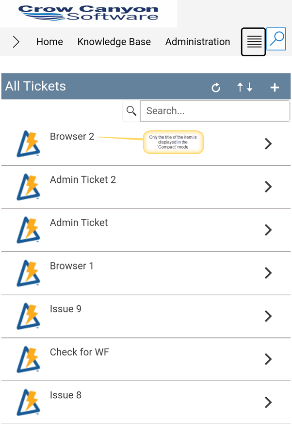
When ‘Compact’ mode is selected, then the fields to select ‘Sub-title Row Columns’ and ‘Sub-title Row Column Value Separator’ are not available as shown below:

Sample output of the List View using compact mode displays the list items with only the ‘Title’ as shown below:
Title Row Column:
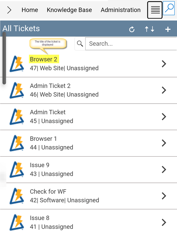
Using this option, select any list column from the dropdown that will be used as ‘Title’ for an item in the List View’s mobile experience. In the below screenshot, the column ‘Title’ is used for this purpose as shown:

The sample output is as shown below:
Sub-title Row Columns:
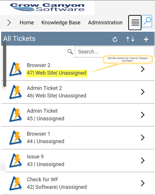
In this option, select the additional list columns that can be viewed for an item under the main title. In the below sample screenshot, the sub-title columns selected are ‘Case Id’, ‘Category’ and ‘Status’.

Sample output will be as shown below:
Sub-title Row Column Value Separator:
Specify the separator to be shown between the above selected sub-title row columns. Examples: Comma (,), Semicolon (;), Pipe (|), etc.
This article uses ‘|’ as a separator as shown below:

Image:
When this option is used, an image is displayed as an icon for list items. The options present under this are ‘Default’, ‘Column’, ‘No Image’ and ‘Other’.
Default:
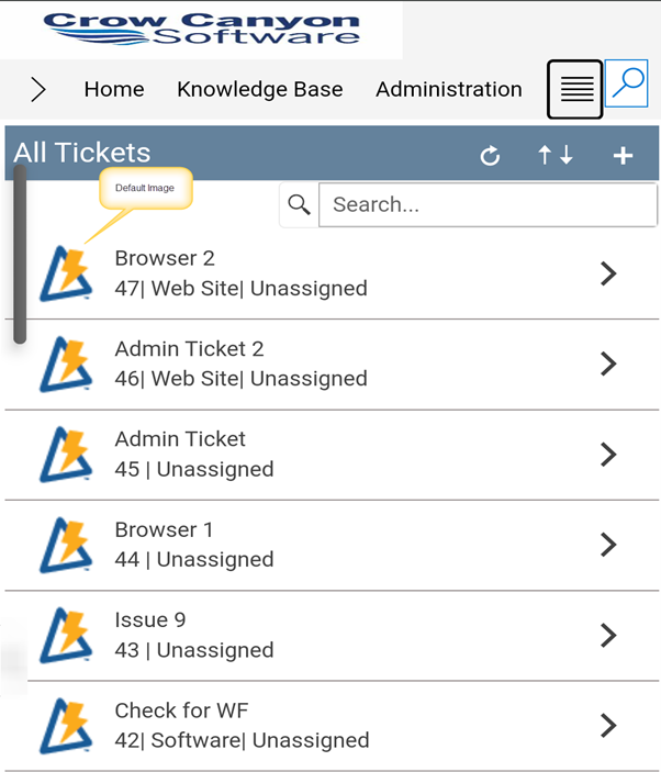
This option is enabled by default. In this option, the list items are displayed with a default NITRO image as shown below:
Column:
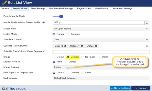
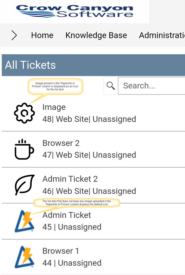
This option is to specify an image to be used as a display icon for a list item that is already present with the list item in a ‘Hyperlink or Picture’ column.
To use this option, select a column that is available in the list containing a picture as shown below:
Any item in the list that does not have an image present in the above selected column will use a default NITRO Studio image as an icon as shown below:
No Image:
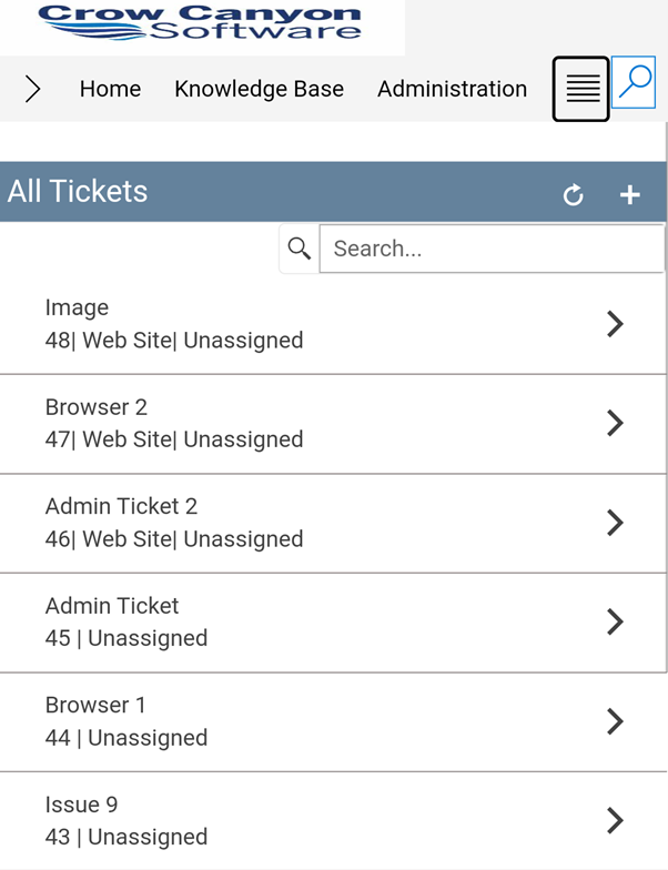
When ‘No Image’ option is selected, then the Crow Canyon List View in the mobile mode will not display any image adjacent to the list items as shown below:
Other:
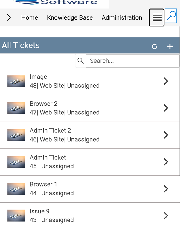
Select this option to specify the URL for custom image. This can be done by uploading an image to the ‘Site Assets’ folder and then specifying the path of the image in ‘Enter Image URL’ section as shown below:

Sample output with a custom image is as shown below:
Launch Form in:
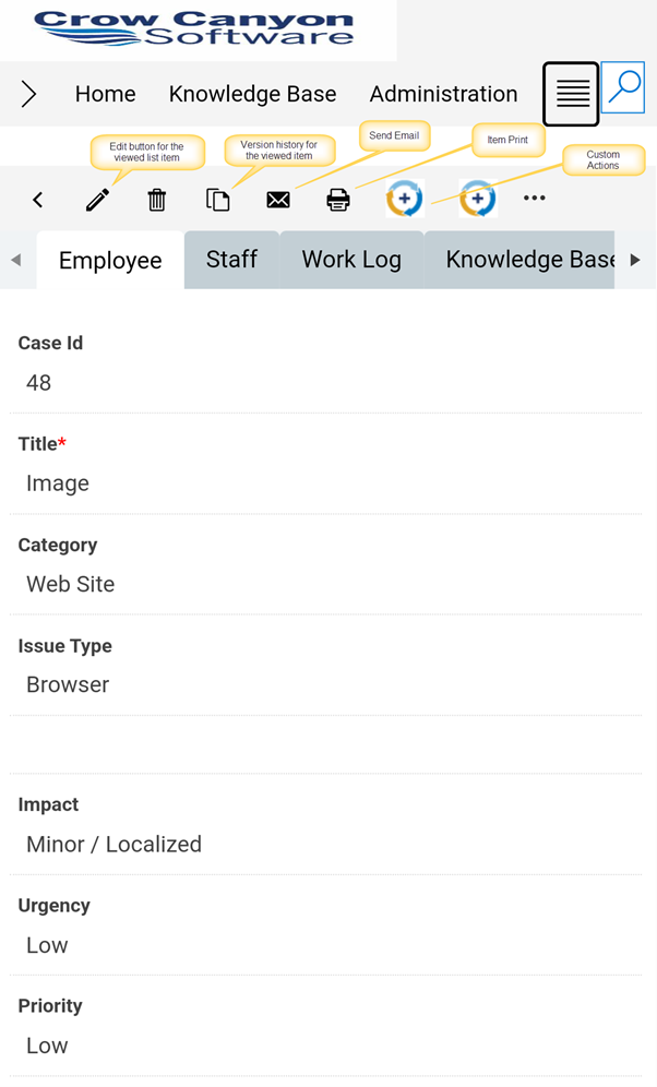
This option is used to specify a way by which a NITRO Form for the list item in the mobile mode can be displayed. It has further two sub-options:
Inline:
In this option, the list items are opened in the same webpart as shown below:
Dialog:
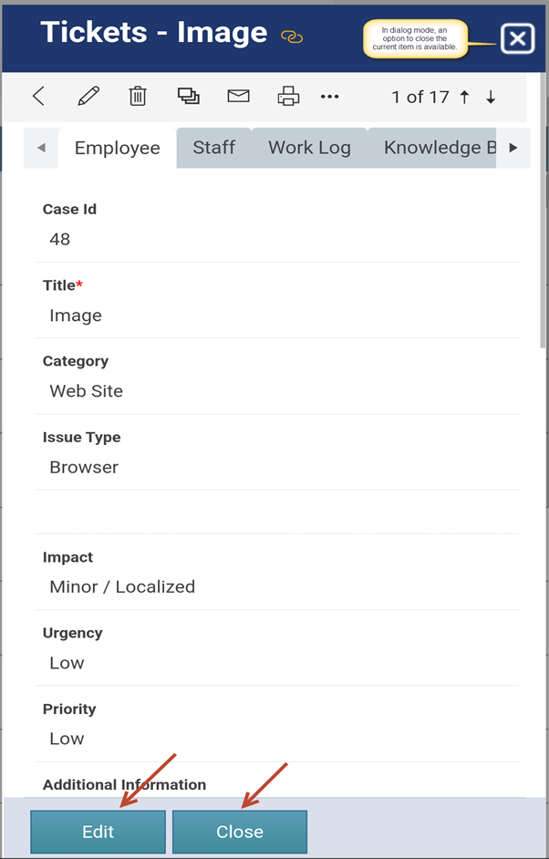
Select this option to open the item in a dialog. The ‘Edit’ and ‘Close’ buttons are displayed at the bottom of the dialog as shown below:
Row Right Cell Display Type:
This option is used to display text to the right side of the items in mobile mode.
It has following three sub-options that can be used as per the requirement:
Default:
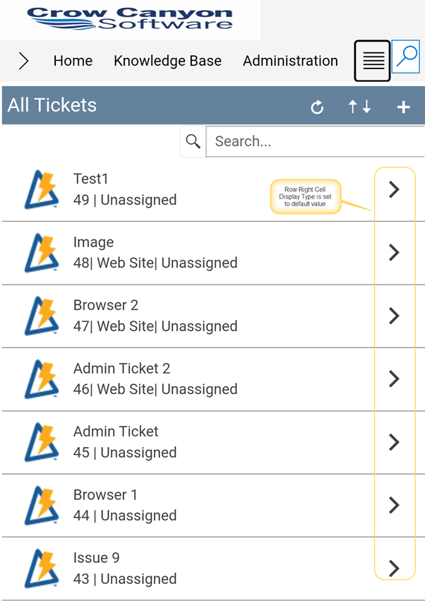
In this option, an arrow as highlighted in the below screenshot is displayed to view the specific list item as shown below:
Content:
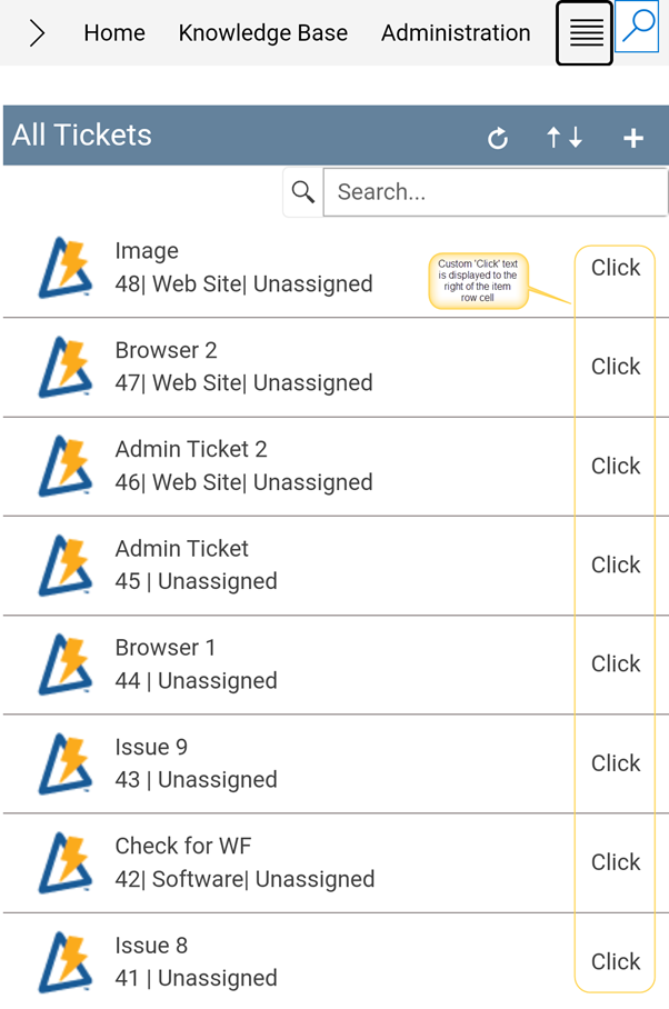
This option is used to specify any custom content that would be displayed to the right side of the item row. When this option is checked, an additional field ‘Row Right Cell Display Content’ is available which is used to specify any custom content.
In this article, ‘Click’ keyword is used that is displayed to the right of the item as shown below:
None:
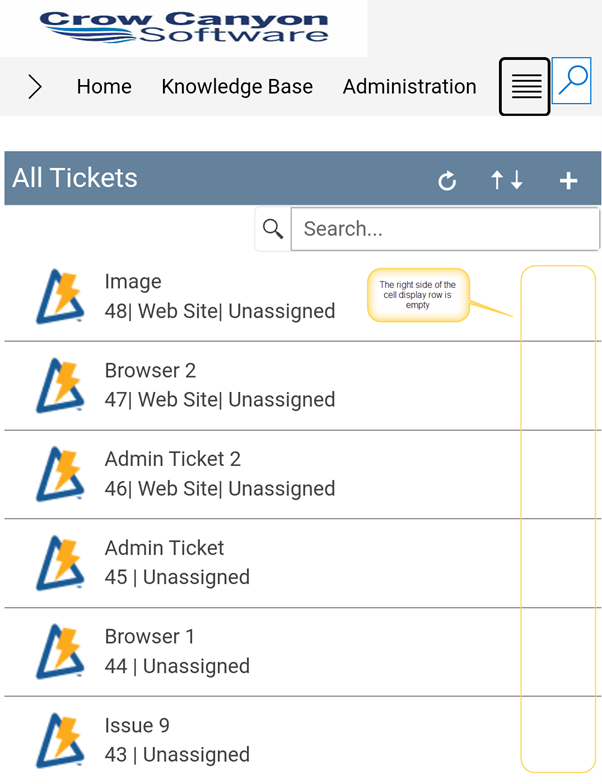
When ‘None’ is chosen as an option then the right side of the row cell for an item remains empty as shown below:
Sort Column:
This option is to sort the items displayed in list view in mobile experience.
In this example, we have selected ‘Status’ as the sorting column as shown below:


